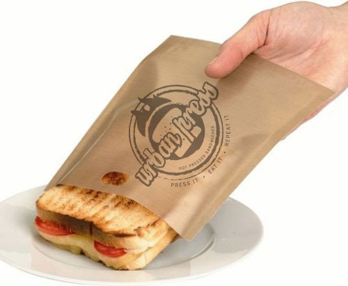
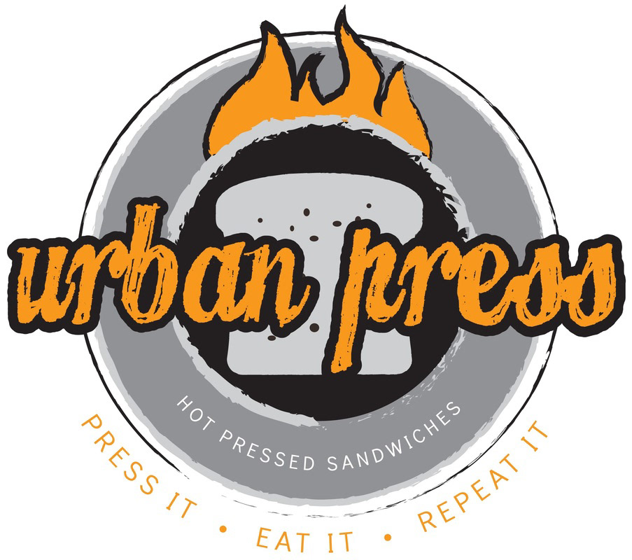
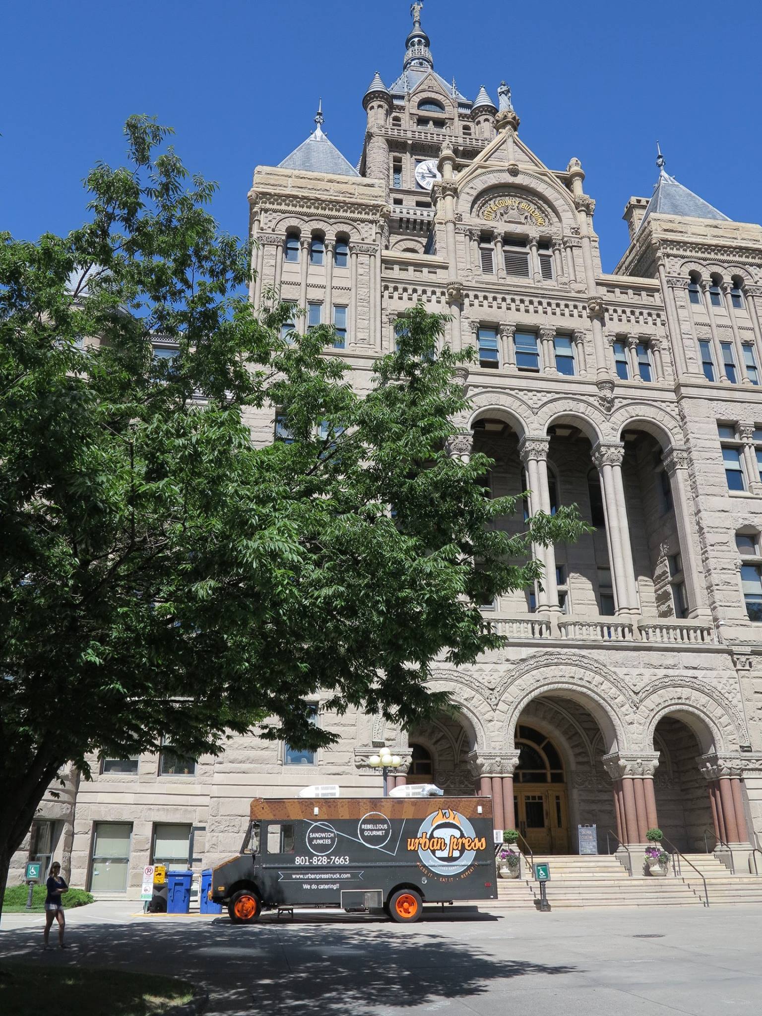
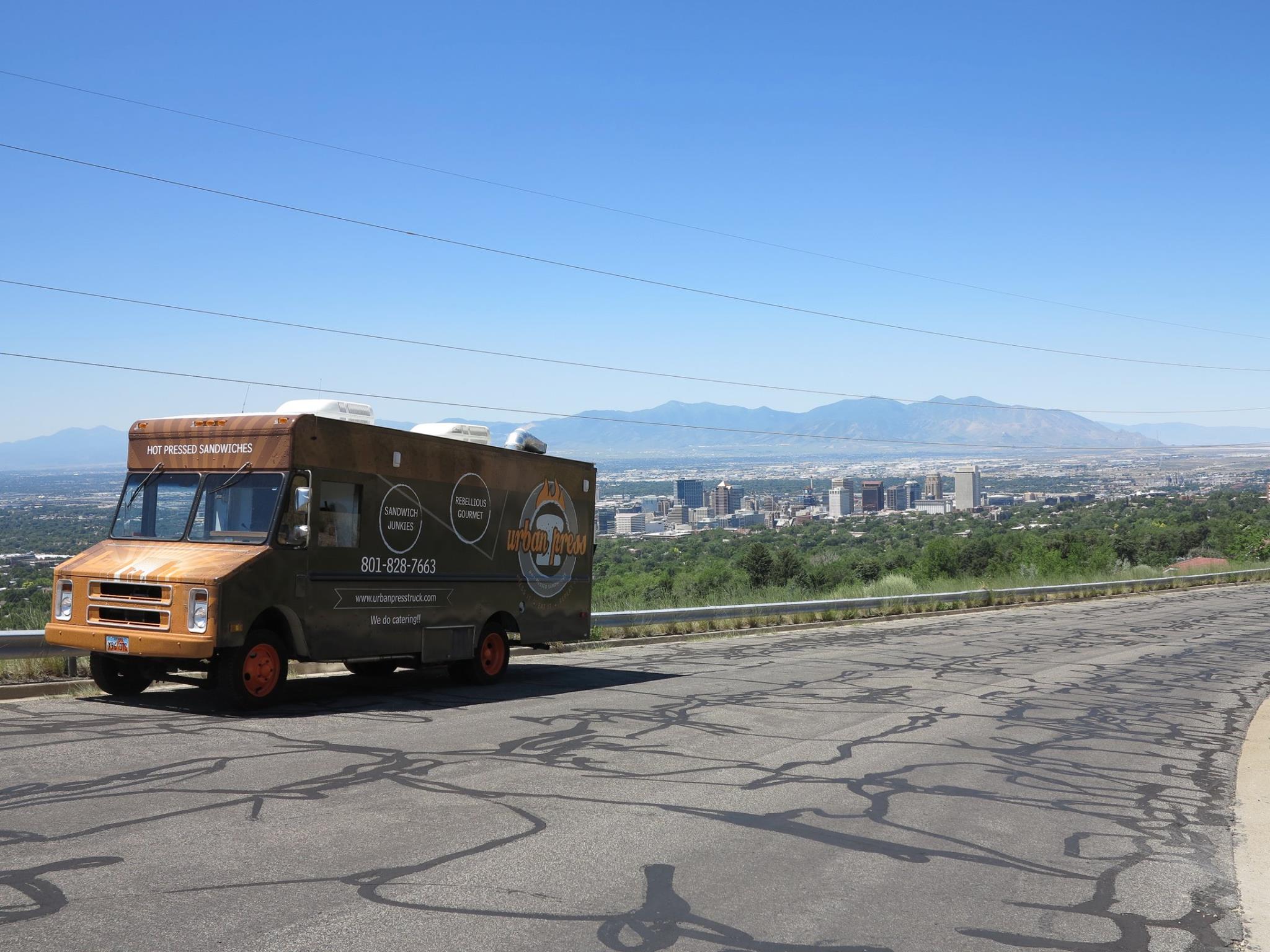
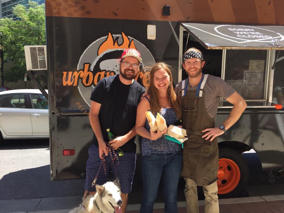
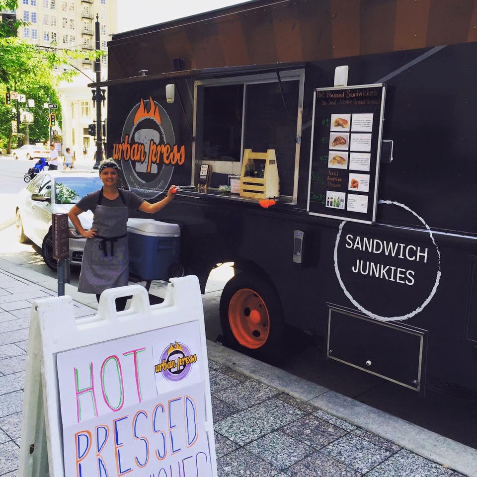
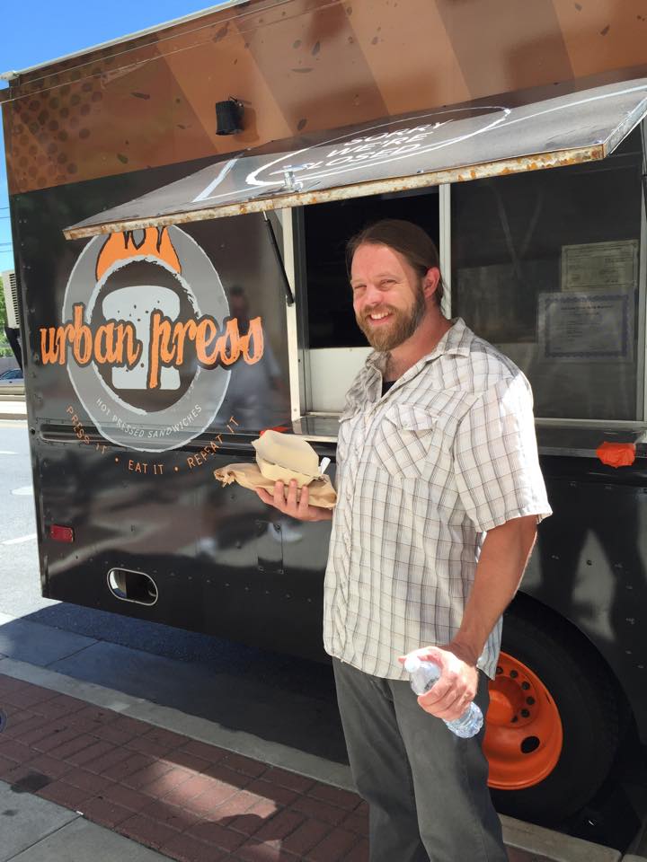
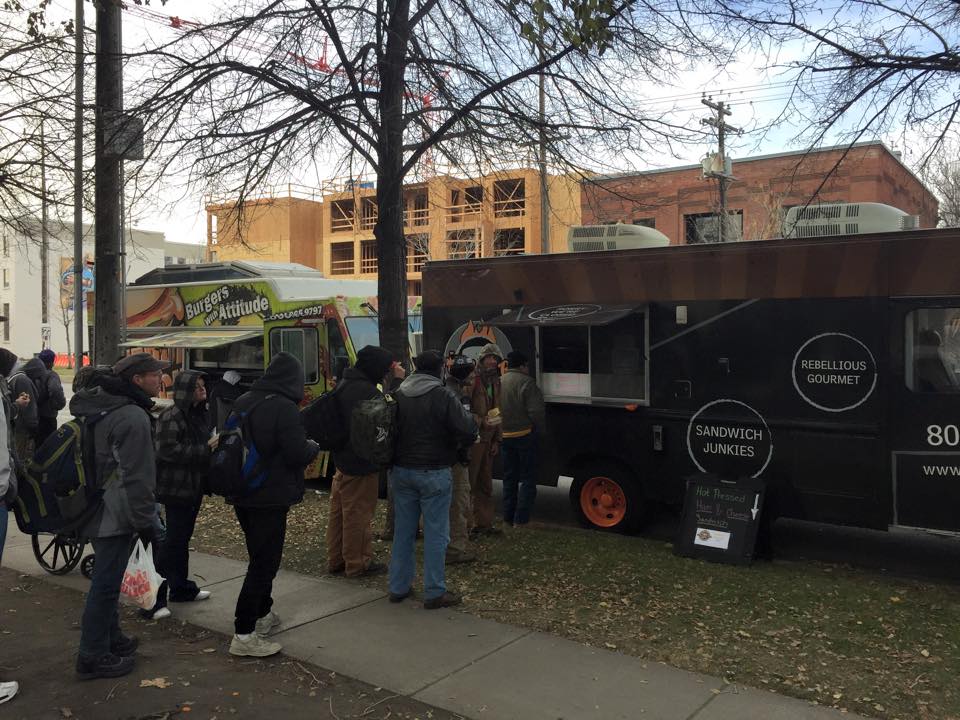
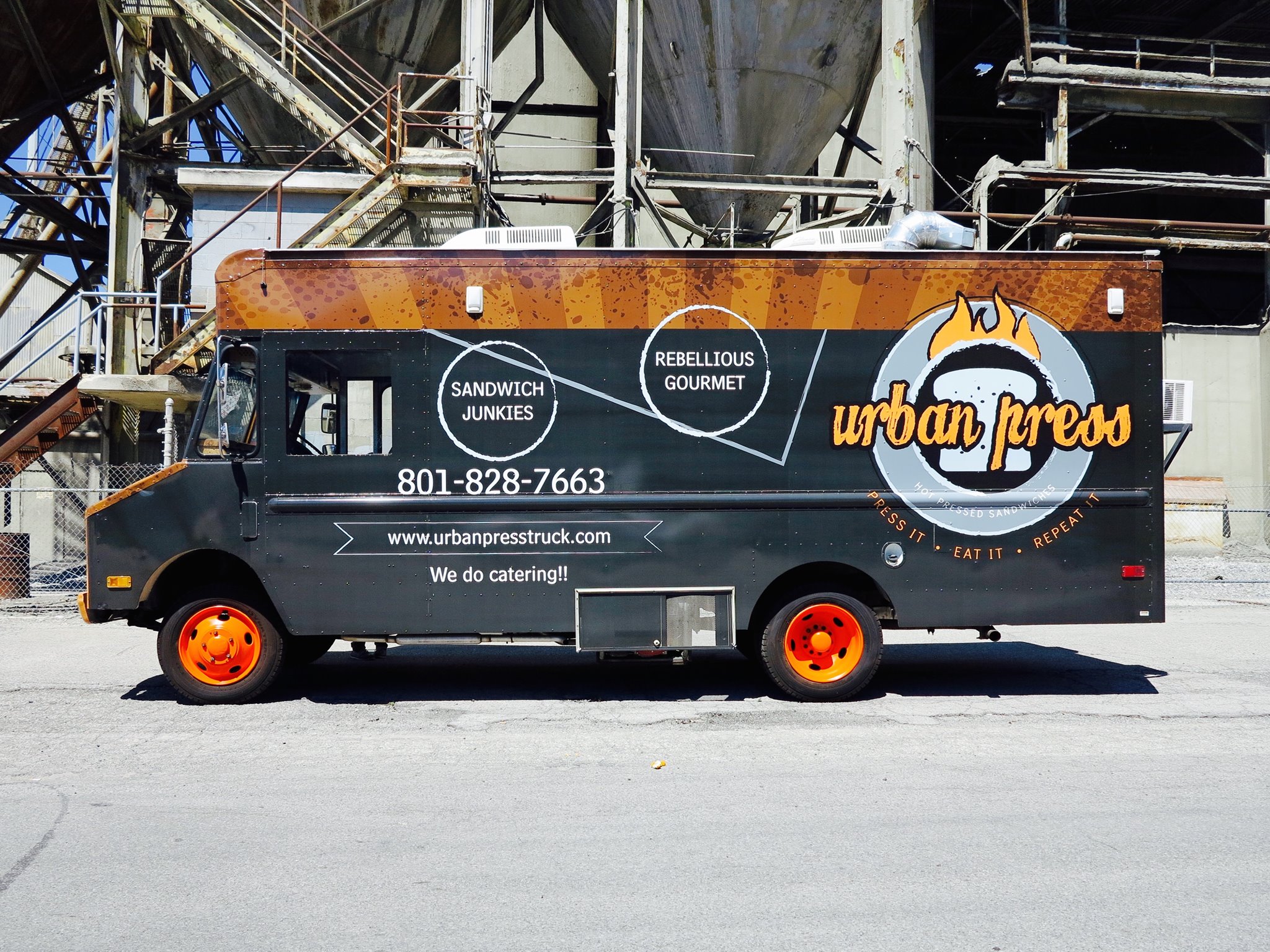
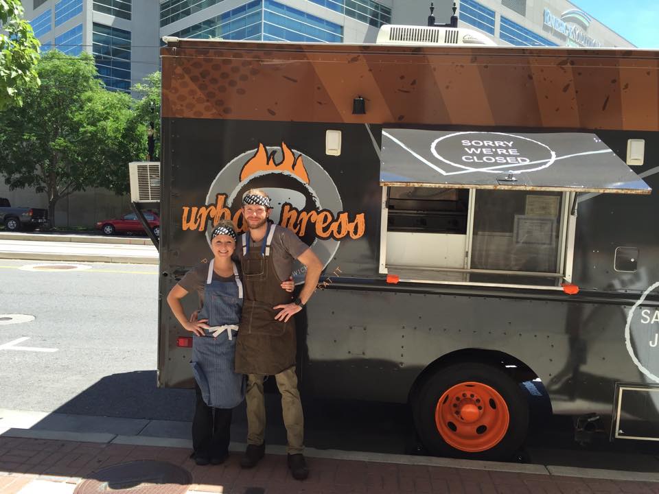
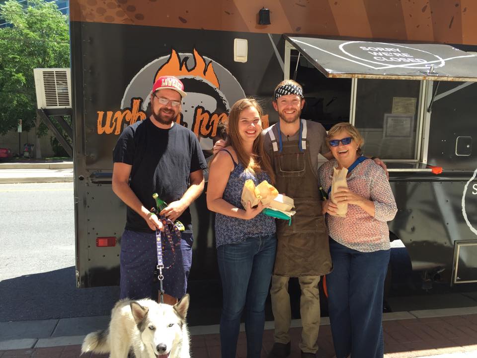
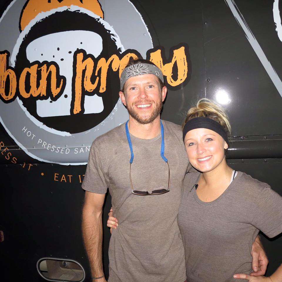
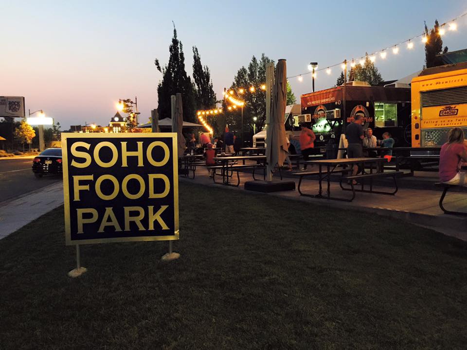
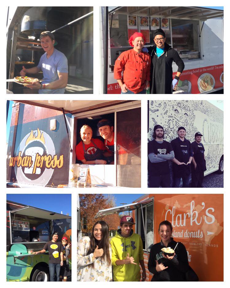
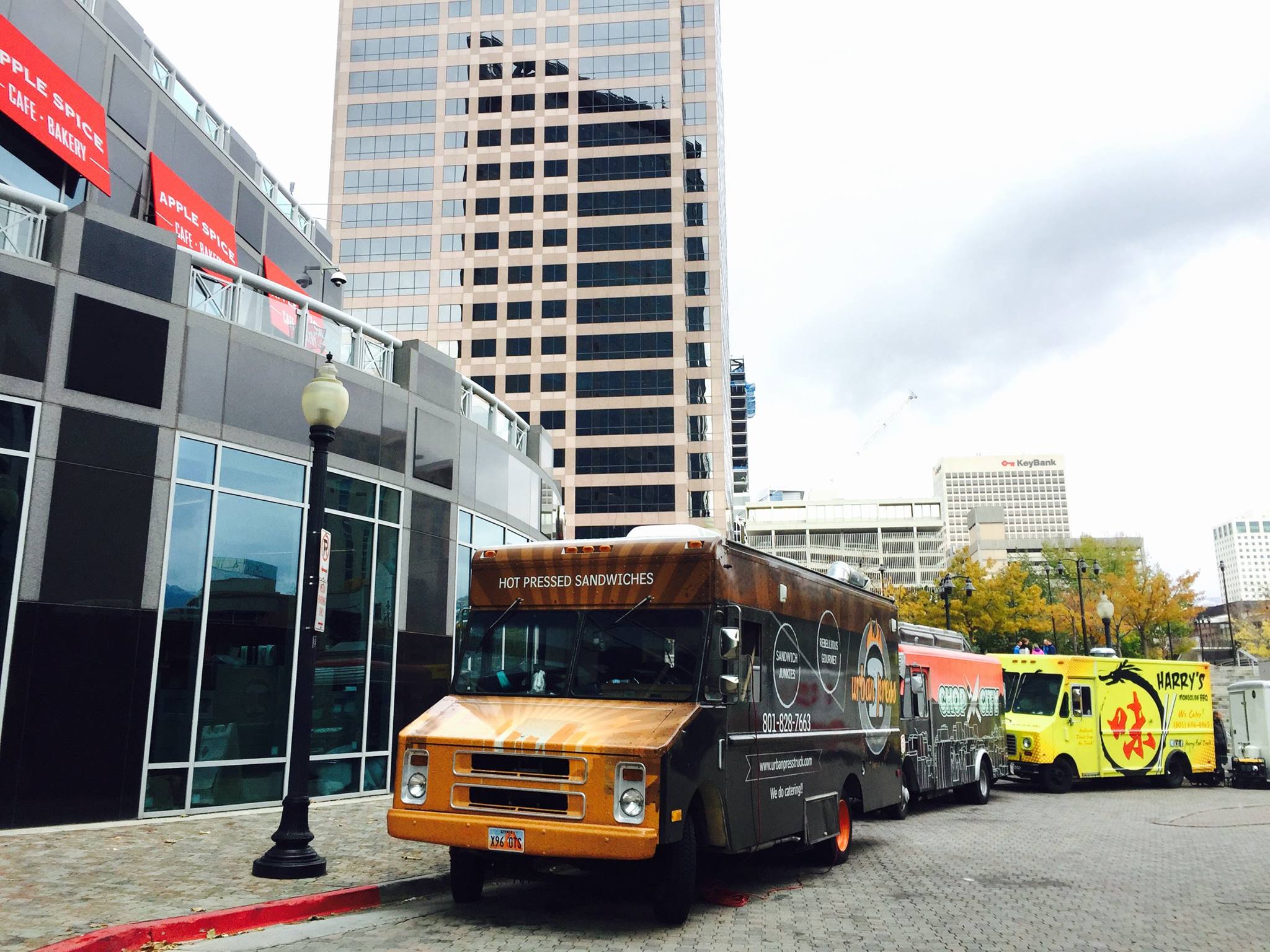
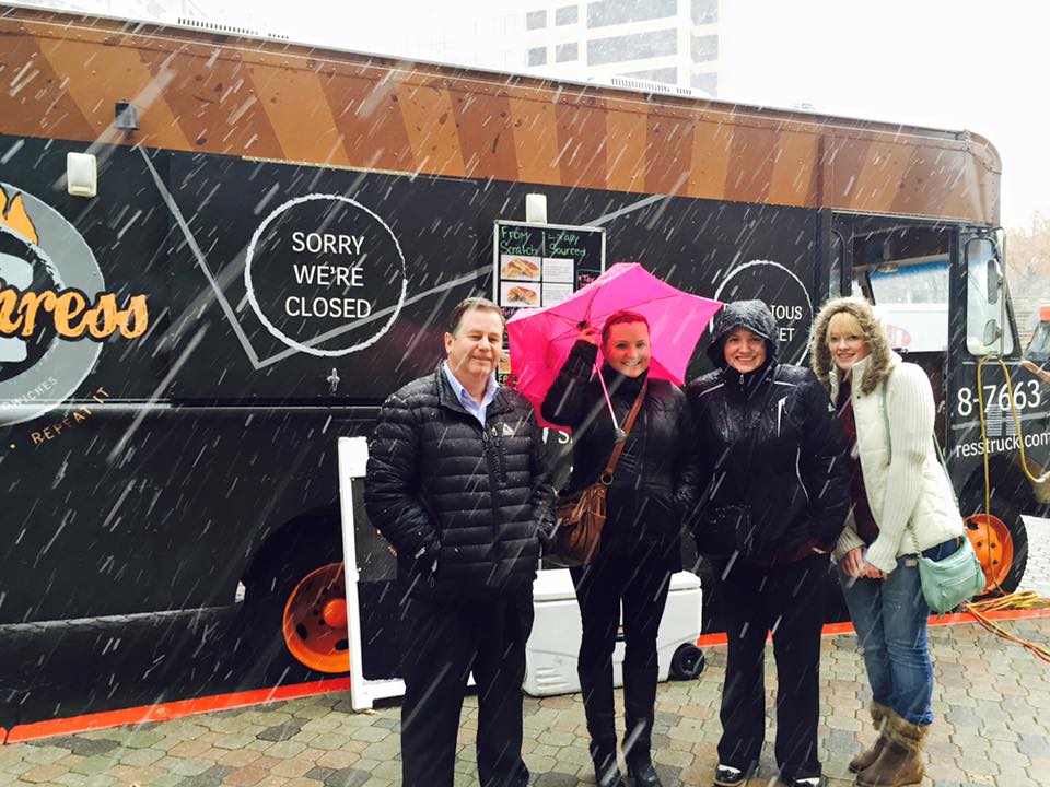
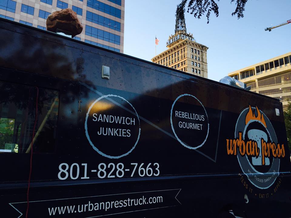
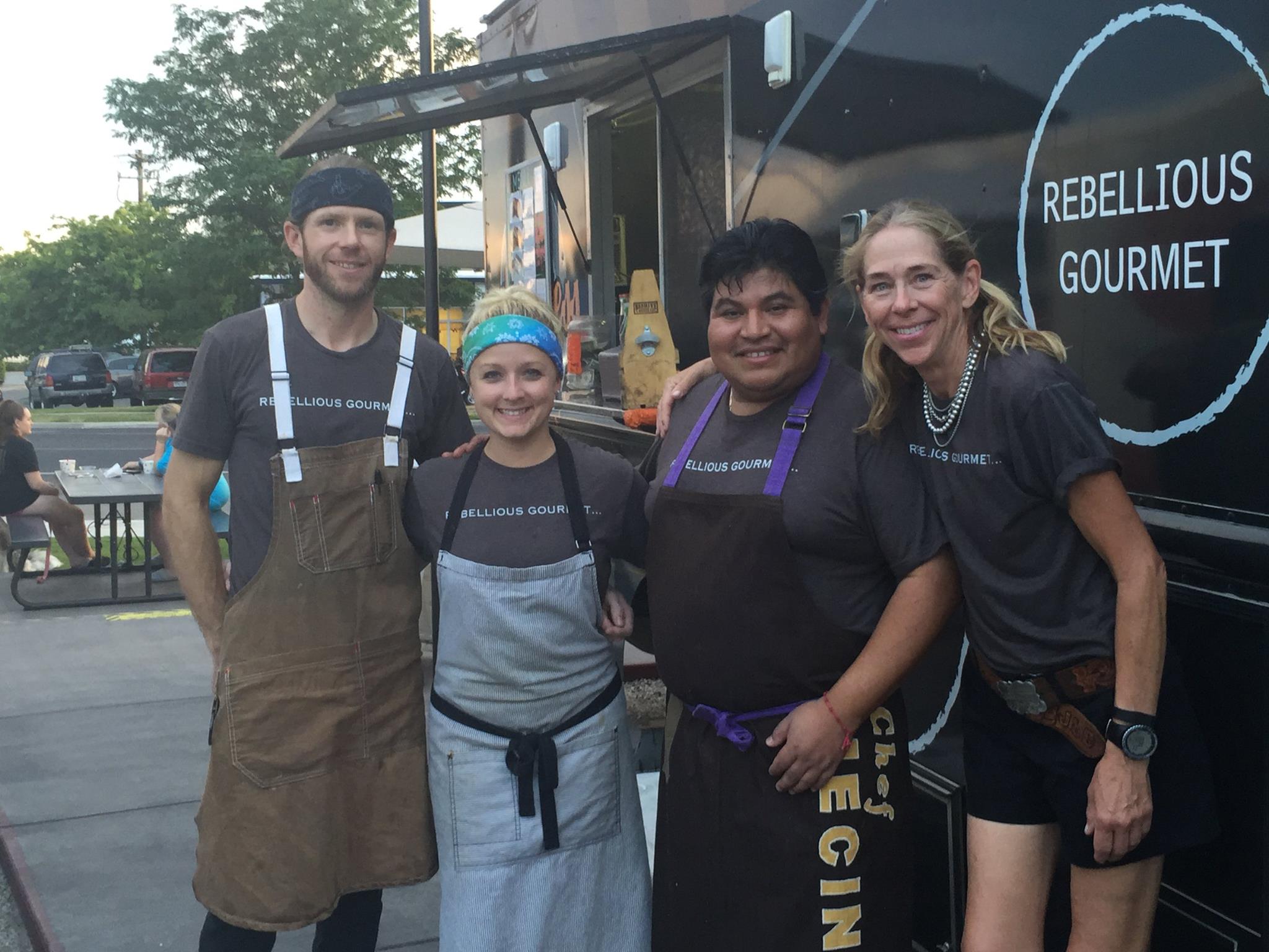
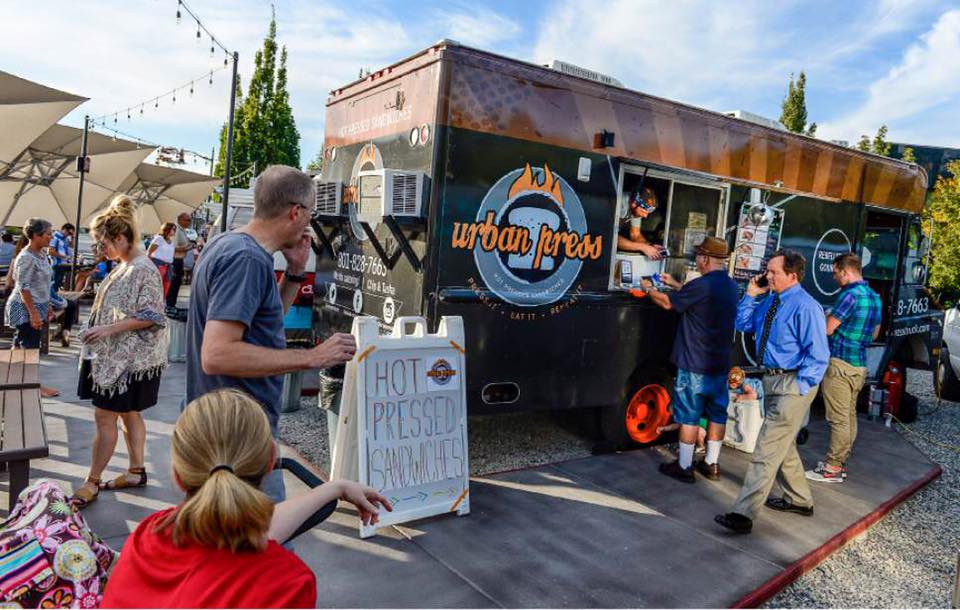
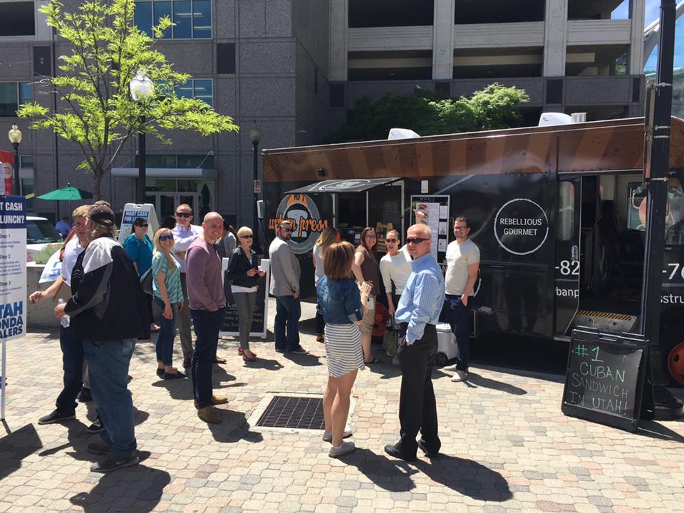
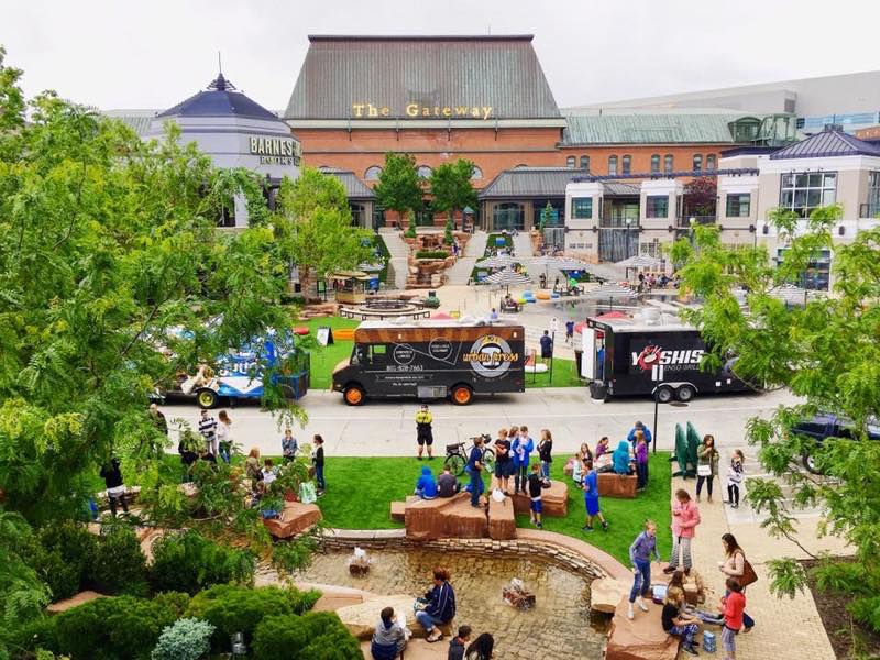
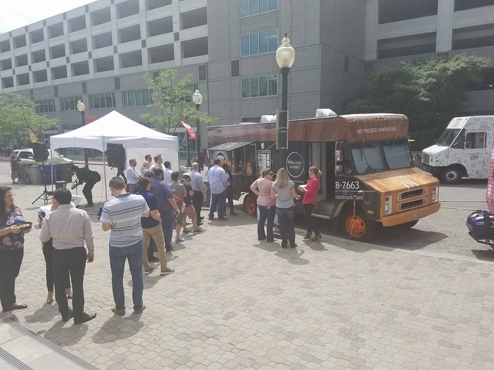
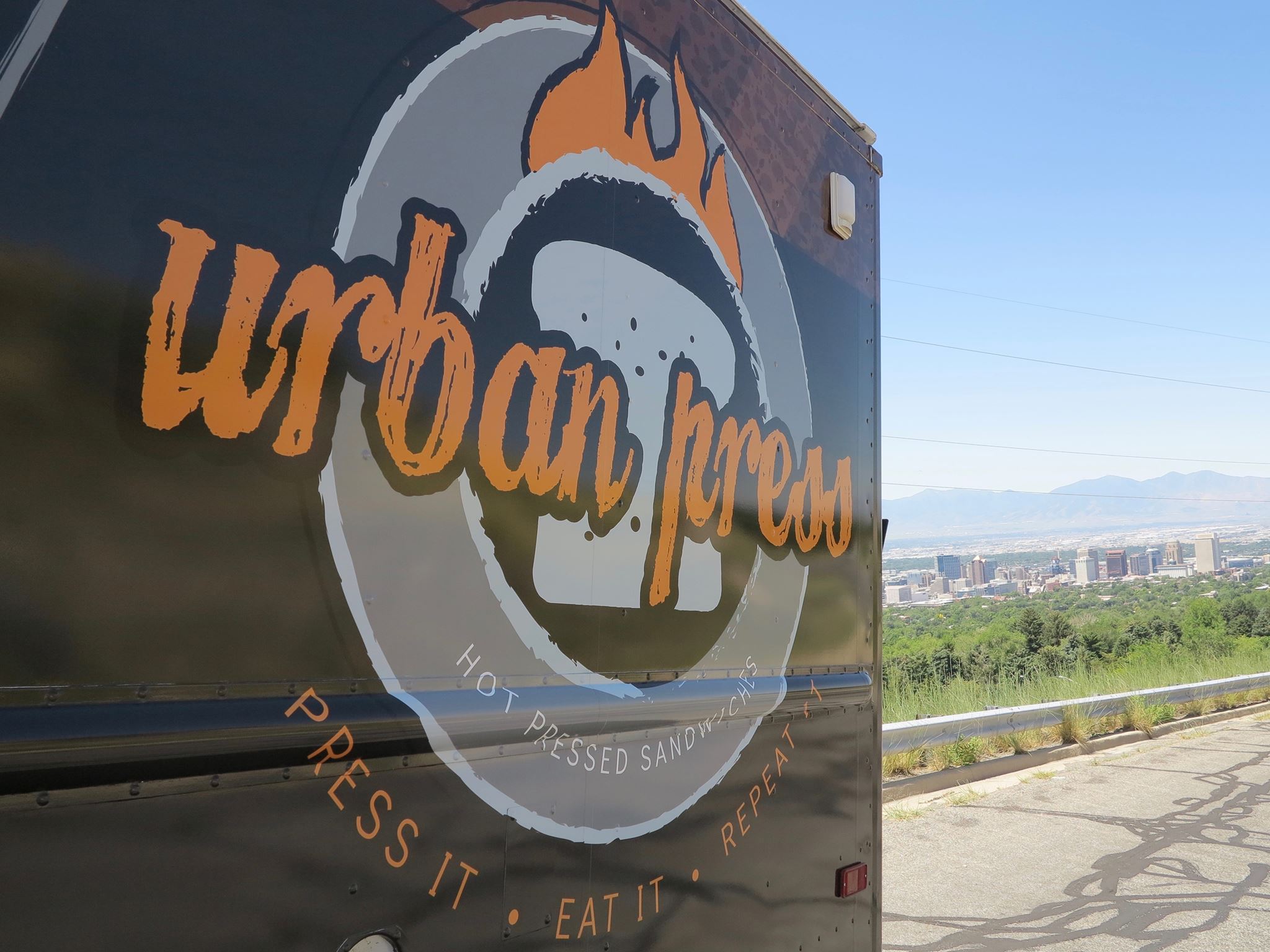
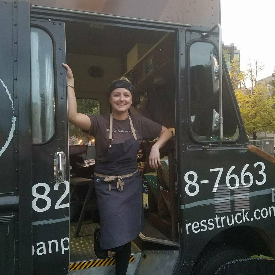
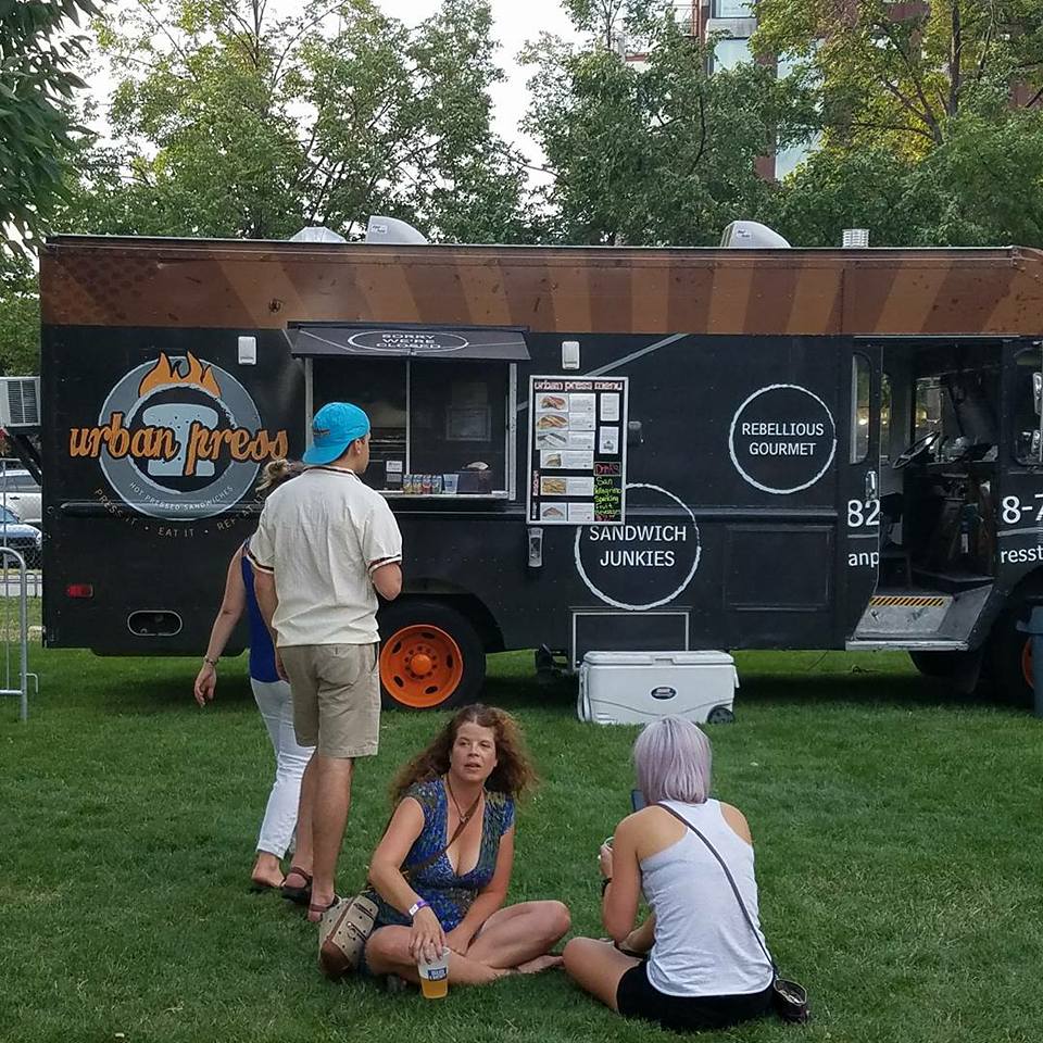
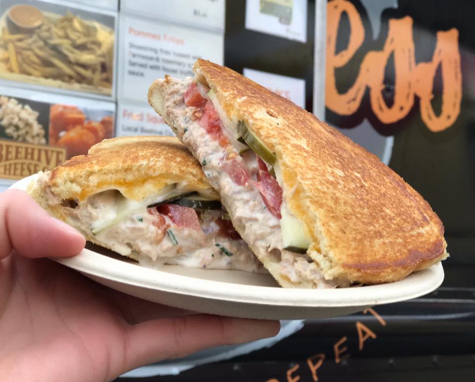
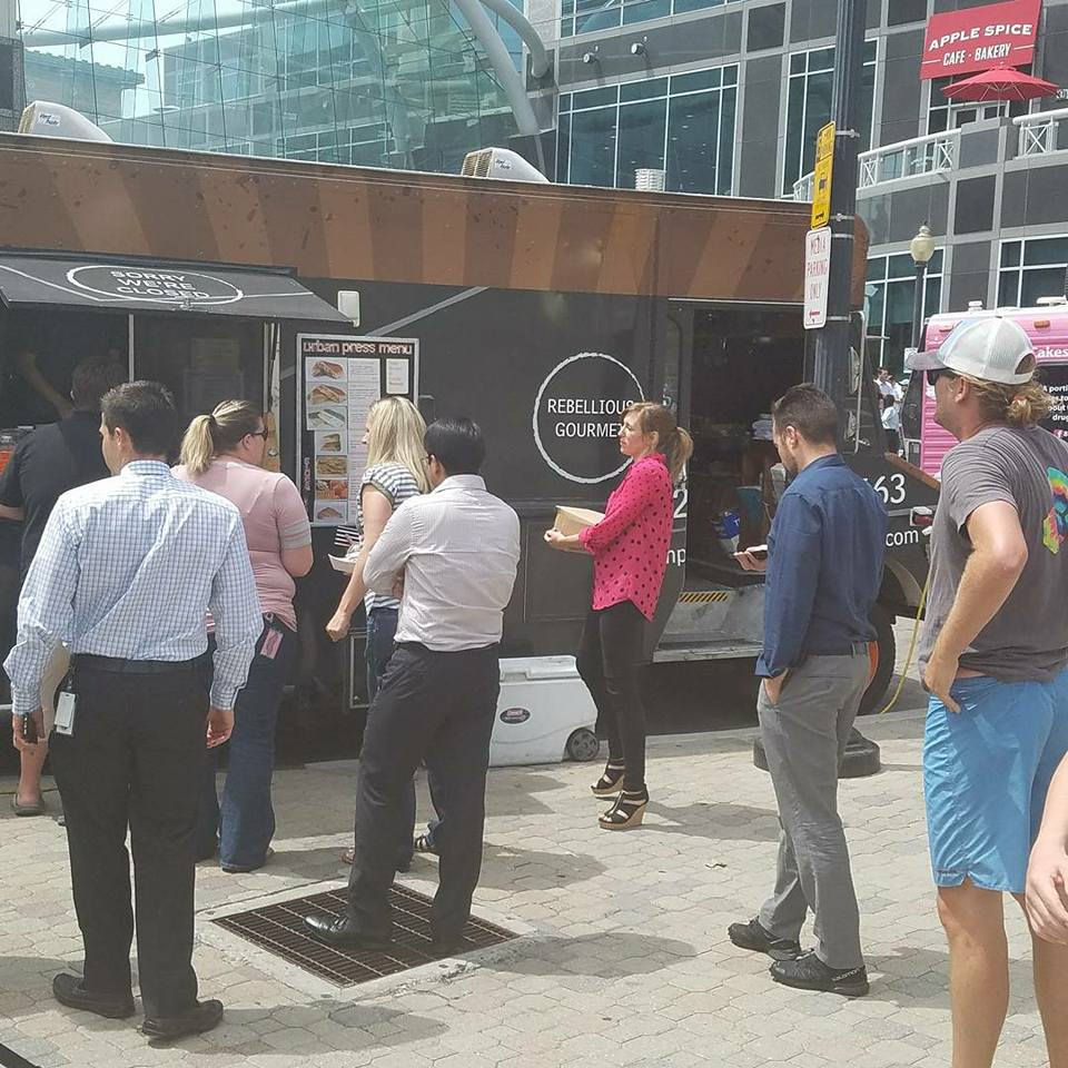
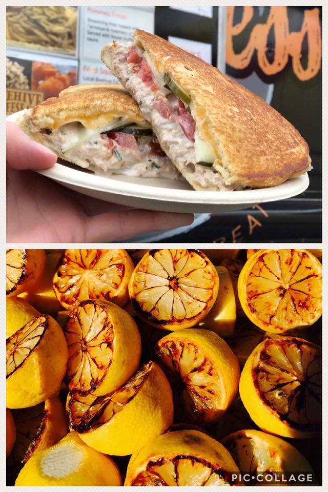
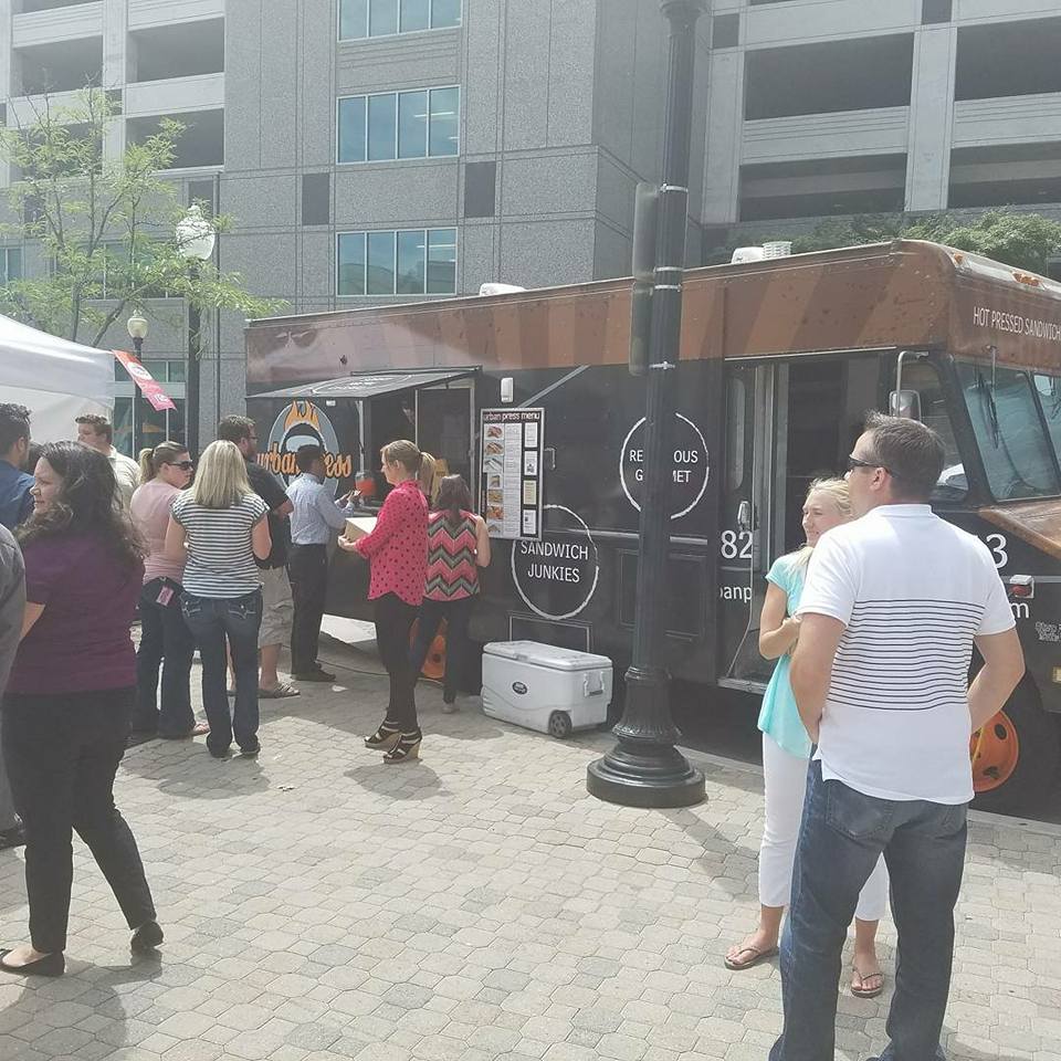
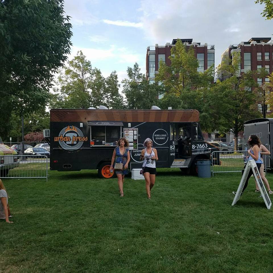
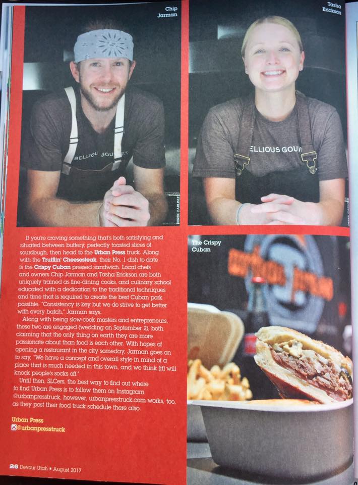
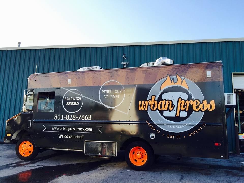
I had the privilege of developing the Urban Press branding for Chip and Tasha Jarman. Their incredible culinary talents truly showed in their mouthwatering creations and the brand truly needed to speak to their magnetic personalities and delicious food. Hot pressed sandwiches represented the model for this food truck brand build. The final brand offered a striking contrast color scheme with a vibrant orange representing heat and energy along with black and shades of grey with grunge layers to harken to the urban feel of its design ecosystem.